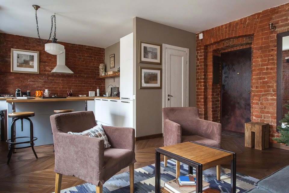
This is how this small studio apartment looks like after it has been renovated. Instead of focusing on updating everything, the project tried to preserve a lot of the original features and emphasize the authenticity of the design overall.

The apartment offers a total of 40 square meters of living space, divided into a social area containing the kitchen, dining room and living space, a bedroom and a bathroom. The living space is where it’s easy to observe all the unique design details, such as the exposed bricks on the walls.

Eco-friendly, natural and durable materials were used during the renovation. The floors and the window frames are made of oak and combined with the exposed bricks they create a pleasant and inviting ambiance with a little bit of rustic and industrial charm.

The kitchen is tucked in a nook, thus gaining some privacy. It has white cabinets set against brick walls, wooden countertops and an island that doubles as a bar and even as a dining table.

The window sills are spacious enough to allow cozy nooks to be created. This makes the living space and the kitchen feel particularly welcoming and comfortable, especially combined with all the other accent elements such as the wall art and the throw pillows.

Although the kitchen is not particularly spacious, it does have a very practical design. An open shelf provides extra storage for spices and small items while also serving as a charming design element that matches the countertop.

There are multiple other accent elements that make this studio inviting. For example, there’s a handmade wool rug in the living room that sets apart the seating area from the rest of the space. Its geometric pattern give it an eye-catching look.

The bedroom is actually not a separate room but simply hidden behind a divider that doubles as a shelving unit. It was built from reclaimed wooden boards.

Grey walls, original 19th century bricks and wooden nightstands on wheels are elements that define the sleeping area. Though a bit austere, the space doesn’t feel cold or uninviting and that’s because of the array of materials and textures included in the design.

The bathroom is the only completely white space. It has a walk-in shower, tiled walls and a large mirror meant to make it feel more spacious than it actually is. All the exposed pipes continue on the same note that the rest of the studio adopted.


Gisele Bundchen's contemporary twist on this emerging design trend is the talking point of her kitchen
Zendaya taps into the subtle power of this accessory to ensure her neutral living room is never boring
Amazon has become a go-to for chic home decor – here’s what we’re shopping from the 2024 Spring Sale
This designer's 'every seat needs a surface' rule has changed my living room layout forever – here's what I mean
5 designer Amazon storefronts that make shopping for stylish homeware so much easier
Joanna Gaines' 'mesmerizing' garden is the perfect example of how to grow cut spring flowers at home
Tan France opts for this stabilizing color palette to 'ground' his guest cottage, experts say
Shark's St Patrick's Day sale is here - and you can save $100s on vacuums and air purifiers
Matthew and Camila McConaughey's raw cabinets possess a texture and warmth that's replicable in our kitchens
Bachelor Pad Featuring A Modern Décor With Accent Details From The ’60s
Minimalist Apartment Interior Design With A Luxurious Touch
Old Victorian School Converted Into Modern Loft In Southwest London
70 Square Meter Apartment With A Continuous Layout And a Wall Divider Made of Plastic Crates
Small Bachelor Apartment With A Very Practical Design – 22 Square Meters
10 Small One Room Apartments Featuring A Scandinavian Décor
Attic Apartment With Rustic Charm And A Spacious Balcony
An Ultra Modern Moscow Apartment With A Glass Wall Between Bedroom And Living Room
The Penthouse Apartment From The Famous Wolf of Wall Street Movie Is On The Market
A Mix Of Scandinavian And Modern Elements In A 75 Square Meter Apartment In Valencia